Easy for everyone to use.

We want this website, and every practice website we build, to be easy to read and use for everyone, including older people, people with low vision, and people who use a keyboard or screen reader. If something gets in your way, please tell us.

Our commitment.

We aim to meet the international guidelines for websites that are easy for everyone to use, version 2.2, at the middle level called "AA". It's the level most governments and organizations ask for.

In plain words, it means people can see, hear, understand and use every page, whatever their eyesight, hearing, movement or memory, and whatever device they use.

In the US, the Americans with Disabilities Act (ADA) is widely understood to cover websites of businesses open to the public, including health practices, and these same guidelines are the usual way to show a website is easy for everyone to use. We build every practice website with this in mind, wherever in the US your practice is. We don't give legal advice, so check with your own advisor if you have questions about your obligations.
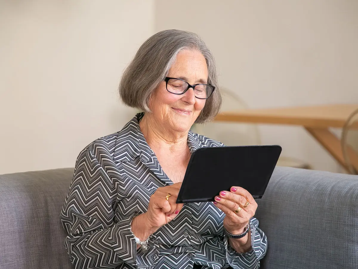
An older woman smiling as she uses a tablet

What we've done.

These are built into this website and into the websites we build for practices.

Colors checked

Every pairing of text and background color was checked for contrast. Colors that were too faint are only used for decoration.

Readable text

Body text is large, with comfortable line spacing. Our decorative headline font is only used at large sizes.

Big tap targets

Buttons and links are at least 44 by 44 pixels, so they're easy to tap.

Keyboard friendly

You can reach everything with a keyboard, see clearly where you are, and skip straight to the main content.

Links you can spot

Links in sentences are underlined, so they don't rely on color alone. Messages use words and icons, not just red or green.

Less motion

If your device asks for reduced motion, animations switch off.

Photos described

Meaningful images have short text descriptions. Decorative pictures are hidden from screen readers.

Clear structure

Headings, labeled forms and landmarks help screen readers and people who skim.

Plain language

Short sentences and no tech words, written for busy, tired or anxious readers.

Known limits.

We want to be honest about what isn't perfect yet.

  • It hasn't yet been tested by people who use screen readers or other assistive tools every day. We plan to do that, and to fix whatever they find.
  • The phone pictures showing sample practice websites are illustrations. Screen readers hear a short description instead of every detail.
  • Some photos are stock photos, and their descriptions are our own.
  • The free website check depends on an outside service, and its results are written for a general audience.
  • The practices shown in the phone pictures, like "Lakeside Counseling", are made up, to show what a finished website looks like.

Report a problem

If any part of this website is hard to use, please tell us. Let us know the page, what you were trying to do, and what got in the way. If it helps, tell us which device or assistive tool you use.

Email hello@stepflowstudios.com. We'll reply, and we'll get you the information you need in another way if you'd like.

Last updated October 26, 2026.

See your new website before you spend a cent.

Send us your website. We'll send back a simple report, and show you what a new client would see.

Free. See your new homepage before you pay, and owe nothing if you don't love it.